version 2025
website redesign
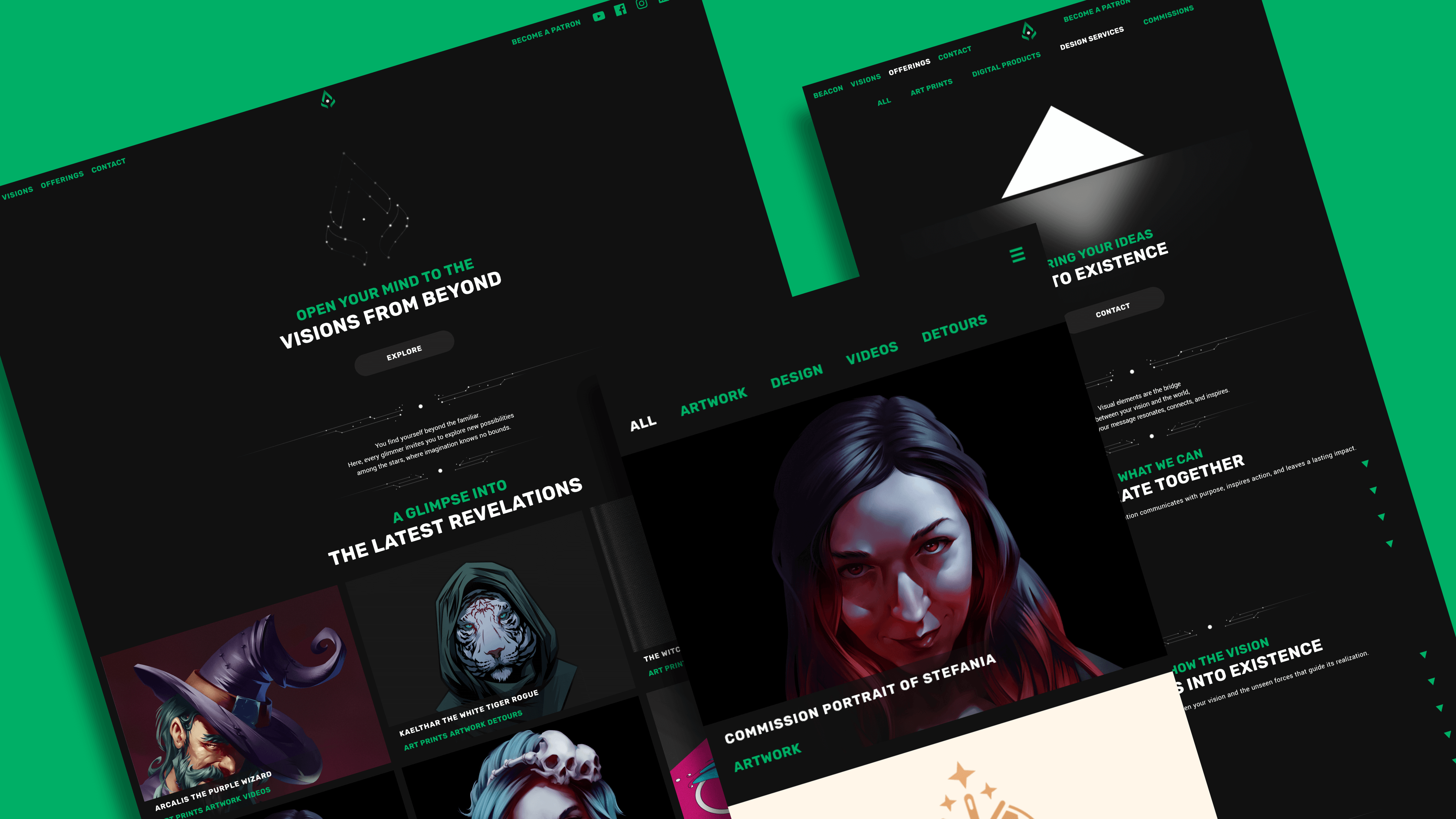
The need to carve a little corner of the internet feels natural as a creative and this journey into redesigning my website for 2025 is part of that. A space to share without limitations or fear, while serving as a natural extension and celebration of my work.
There are plenty of options to choose from to fulfill that need. Social platforms for visibility or portfolio builders for professional use, which are basically free, might be enough for most. But in a world dominated by algorithms and shifting trends, safeguarding your creative legacy feels more essential than ever.
For artists, designers, and creators of any kind, it’s also about safekeeping your work from exploitation and embracing creativity fully while sharing it on your terms.
SPARK
A couple of years ago, I decided to invest in my own website. I knew nothing about website development so I went with what seemed the best fit for me at the time, namely wordpress. The .com one, not the good one.
However, I didn’t realize how much the platform’s limitations would affect my experience. Many essential features were locked behind unexpected paywalls, even if I already paid a pretty penny for a subscription, and I had to work around them constantly. I patched things together with haphazard CSS, just trying to make it “good enough”, often sacrificing time and efficiency.

Playing it safe influenced every decision I made. Following “best practices” for structure and functionality, or fearing that the investment wouldn’t pay off, led to a website that felt uninspired. It wasn’t fun to maintain, it wasn’t fun to use, and didn’t achieve much.
After two years and too much money wasted and armed with insights from my earlier missteps, I approached the redesign with a clear focus on usability and expression.
This time, I used wordpress.
The good one.
IGNITION
The first step is to approach the problem from a user experience perspective. Not only practically, but also thematically.
The navigation needs to be simplified. Even if my choice is to present a vast range of projects, I still need to make it easy for users to explore.
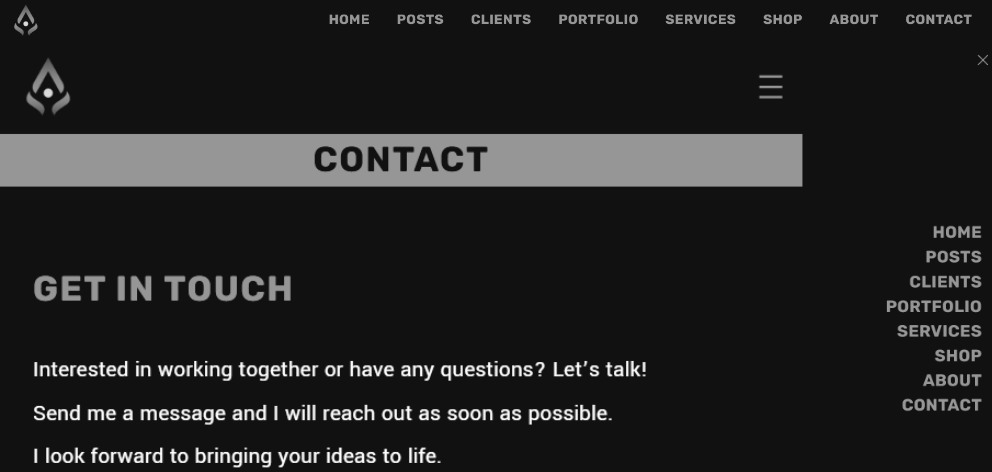
To achieve this, I focused on reducing the number of pages and subpages, ensuring clarity and focus.
ARTWORK focuses on anything that is painting and illustration related, while DESIGN includes branding, graphics and more strategic endeavors.
VIDEOS include process recordings, narration and audio-visual projects, with DETOURS encompassing the experimental and atypical work.
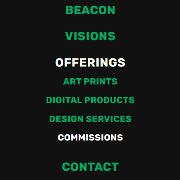
The OFFERINGS page contains products and services, while CONTACT is a direct channel for anyone interested in working with me.
The central pillar of the website is the gallery, which will be made of posts, not individual pages.
Each one will be tagged with the appropriate categories that redirect to the specific subpage I made for each.
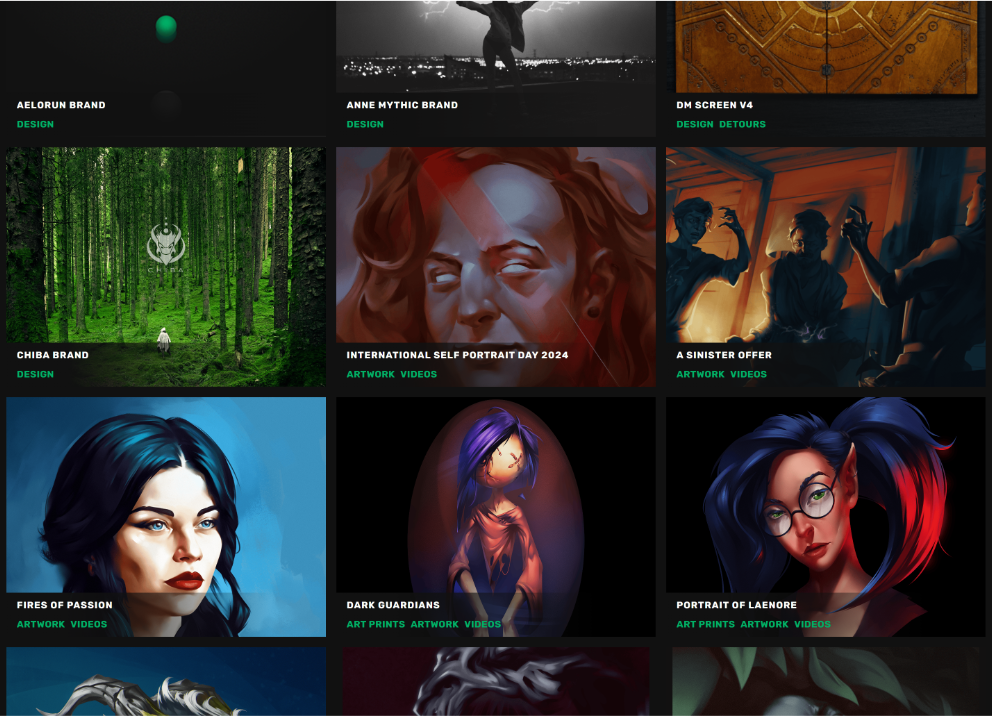
This approach streamlines updates while ensuring visitors see the latest and most relevant work for each project type.
As a consequence, the upload process is reduced to just making a post and the galleries will automatically populate and display it on the appropriate pages.
Before, every update took too many steps and issues would get lost in the chaos of it all. Frustration leads to avoidance, which means the website doesn’t stay updated or the presentation suffers. I want the experience of using it to be effortless joy, not a chore.
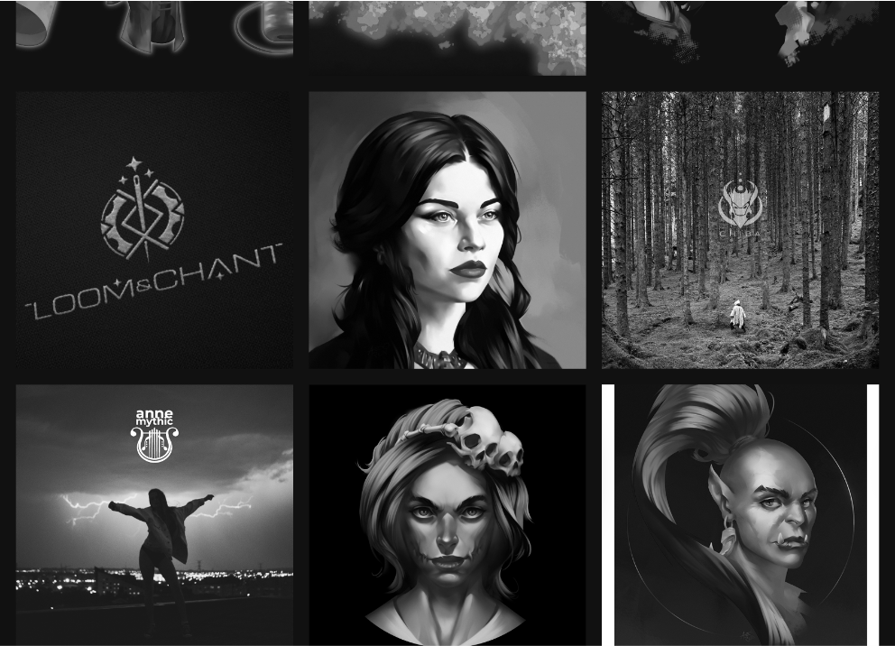
This solution creates an intuitive and clean structure that’s easier for me to manage and for visitors to enjoy.
From a functionality standpoint, I knew I needed more room for the content to breathe. But empty space didn’t feel like the right answer.
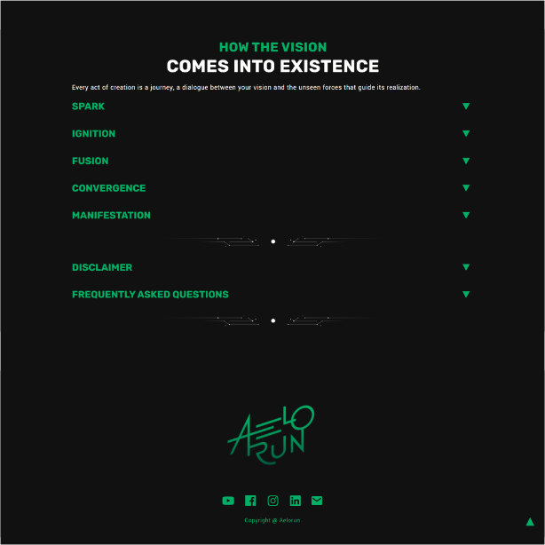
Since I already use the constellation motif, I made two dividers that fit the brand visual identity and also the need to separate sections clearly.
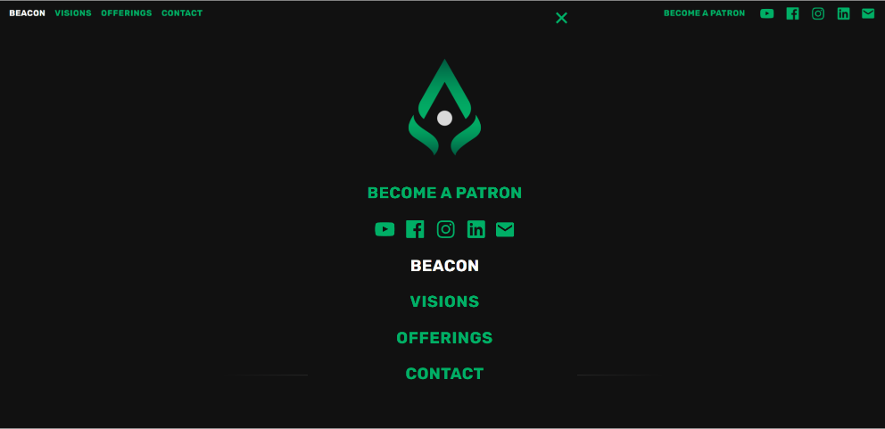
I also wanted to see at all times where I am on the page based on the navigation, without relying on page headings. For this, the title of the page you are viewing will change color, and if it’s a subpage, it will change the parent page’s color.
For sections that require a lot of text that’s more informative, such as an FAQ, I needed a drop-down solution that would auto-collapse if the user jumps to another section. This way, you see only the information you’re interested in. There’s no need for multiple drop-down sections to be opened at all times, as that would take a lot of screen space and create too much noise.
A functionality I wanted to add was a scroll up button that would appear in the footer to help you navigate back to the top of the page.
Both the drop-downs and scroll up buttons use the same triangle symbol, adding to the brand’s visual consistency and guiding user intuitively.
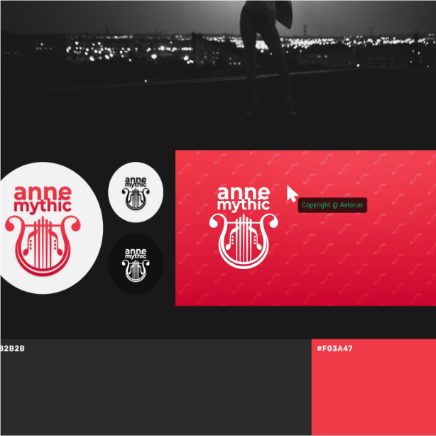
Additionally, I need to protect my work, even if in a small way. I didn’t want to use watermarks on my work, so I found another solution.
A message that appears next to the cursor when you try to right click or drag an image to save or download it. No image or graphic element can be downloaded in this way.
It might not completely prevent theft but it gives me peace of mind.
The mobile experience should be simple, and the 2022 version achieved this somewhat, but the auto-collapse of the subpages and showing you where you are on the site is a must-have.
Images should auto-collapse into columns for a responsive experience.
The sliding subcategory solution from the old website was something I want to keep, as it gives a lot of responsive functionality on mobile.
Finally, brand voice was crucial. I want clarity and usability, but I also want the site to feel like AELORUN.
You don’t need me to over-explain what’s obvious. You know the BEACON page is the Home page.
You’ve seen galleries and portfolios before. But now you’re invited to explore VISIONS.
The structure stays simple, but the brand voice comes through in the details. It’s not about fitting into every “must-do” list for SEO.
The headings reflect the experience of connecting to an ancient, cosmic entity that guides, enchants, and sometimes empowers you.
fusion
With the core ideas written down, the first step is to research and pull inspiration from websites I enjoy. They include portfolios, blogs, and everyday platforms that have elements close to what I envision.
Figma at the ready, I start to slowly develop elements and user flows.
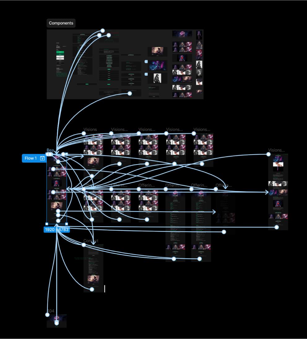
This is the part where user personas come into play. I didn’t develop them as full-fledged characters, but I came close. By stepping into the shoes of potential visitors, I could identify overlapping needs and streamline their pathways through the site.
For instance, Patrons want to stay updated, see the latest work, and SUPPORT me easily.
Design Clients need to see problem-solving examples, find DIGITAL PRODUCTS and contact me for projects.
Art Clients want a smooth way to browse ART PRINTS or request custom work.
This process slowly gives shape to the rough idea of the website, until an interactive solution forms.
A few tests and feedback notes from outside confirms when I am close to a final structure and ready to actually build the thing.
Before I do, I think it’s important to pay homage to the old website. It served its purpose, taught me a lot and I was proud of it and my work. I know that I’ll have this to look at when I forget how far I’ve come.
convergence
I start fresh with a local WordPress setup. After installing the essential plugins, such as back-ups and security, I start to slowly build the visual and brand elements that lie at the foundation.
I document everything, as I always do. This way, I can replicate the process in a granular and reliable fashion, if need be, and helps with troubleshooting.
I decide to avoid bloat and focus on clean layouts that I can customize with the tools already available on the platform. Navigating plugin limitations and troubleshooting custom code taught me how to balance ambition with feasibility. It also reinforced the fact that I am stubborn.
Basically, if I can build a functionality or element using some basic HTML, CSS and JavaScript, I will go through the effort, so I don’t rely on plugins.
The navigation, footer and galleries are the most important and complicated elements, so these receive the most time and effort.
After that, the rest of the elements are slowly added and tweaked, with the text being added towards the end.
I would like to say that the process was this linear but it never is. Jumping back and forth between stages, refining or trying things out are core part of developing a great product that stands out and works well.
When there’s nothing left that can be achieved locally, the website is transferred to its new online home.
This is where connection-dependent additional functionality is added, such as analytics or newsletter services.
After a few more days of tweaks, checks and tests, a journey that started in August 2024, with the bulk of production taking place in November and December, comes to an end.
MANIFESTATION
Now, the unbound and vast creative energy of AELORUN can be more easily experienced and maintained.
Reflecting on this journey, starting over has taught me so much. Not just about front-end development, UX, and the sheer amount of work that’s being done behind the scenes of a website, but about how I want to present my work.
This process reinforced the importance of starting with a strong vision, prioritizing usability, and embracing adaptability. It’s a blend of creativity and functionality, and I feel more confident following this process into future projects, both for myself and others.
Exposure to a bit more CSS here, a bit of HTML and JavaScript there, also sparked my curiosity and interest.
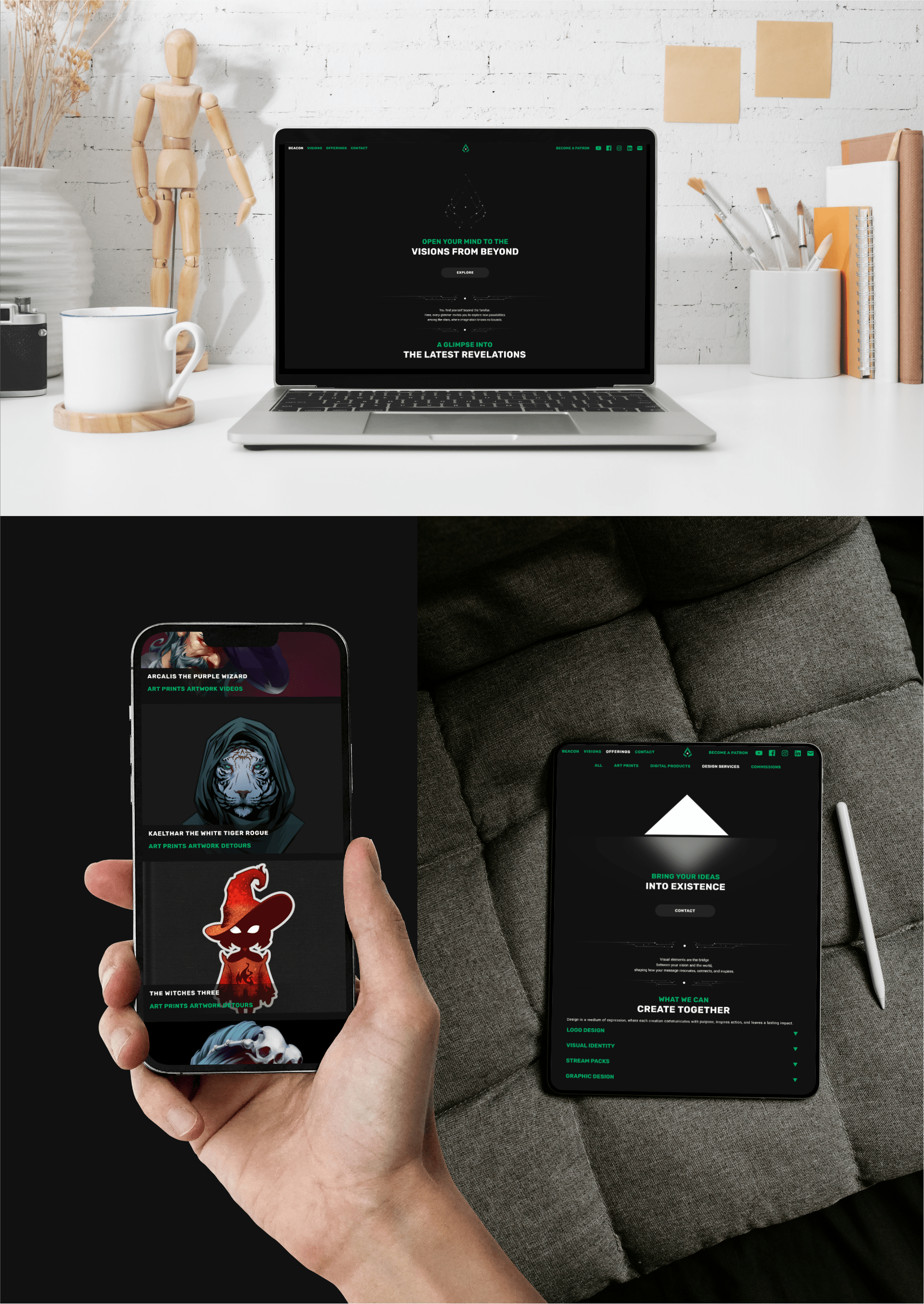
As I continue to refine the site, I look forward to explore and learn about e-commerce for more physical offers, integrate my own digital products shop, and add an on-site donation or reoccurring support system. Being reliant on external services is a temporary compromise but the technical limitations are complex enough for me to leave this for later.
Overall, I’m excited for the future and I’m excited to see how much more I can learn and do.
Developing this new version was a challenge but extremely fulfilling. It’s simple for both the user and myself, it’s clean and easy to follow and the efficient process of maintaining and adding to it opens up more time to create instead of troubleshoot.
At this current stage, it feels better to use and develop.
